Lettering an important part of comics. Beyond just telling you who's speaking, word balloon placement can affect storytelling, page readability, expression, and determine horizontal order of drawn characters. This is why most artists prefer full scripts instead of the "Marvel Method". If done well, most even notice your undercover genius. Other aspects of lettering include thought balloons, titles, logos, blurbs, and sound effects.
Mainstream comics are lettered with fonts these days, but a lot of independent artists still letter by hand. Some simply prefer the inherit "do it yourself" feeling, or just seeing it on the original art. Others think integrating words with pictures is faster without a ton of digital workarounds. Longtime comics writer Mark Evanier wrote a thorough comparison of digital and hand lettering in 1997.
Lettering for this class will be done done by hand with calligraphy pens, ink, paper and the almighty Ames Guide. Like any other skill, the path to good hand-lettering is paved with practice.
Dialog Lettering
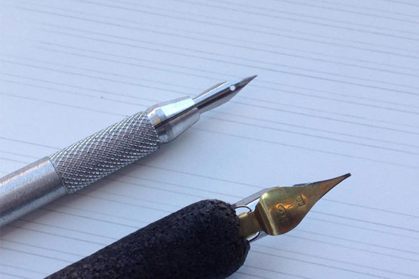
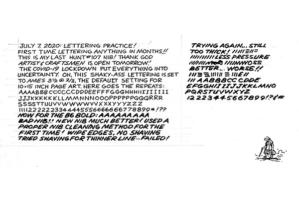
Speedball nibs 107 (thin and italic lettering) and B6 (bold lettering) are the standard tools for 10 x 15 inch, 3.5 Ames guide original art for mainstream American comic books. Speedball C6 is an alternative to the Hunt 107 for dialog lettering. Matching the desired effect with your individual ergonomics will take time and dedication. It's a never-ending journey, but practice and persistence will eventually make lettering an essential element in composing your work! Here are a few examples.
Any waterproof india ink is fine, but I prefer Daler-Rowney's Calli non-clogging calligraphy ink for lettering. A one-ounce bottle is $5 at Blick.
Be sure to clean your new nibs before using them. Manufacturers cover them with an oil finish for long term storage. Cover the nibs with either toothpaste or de-greasing dish detergent for 30 seconds, rinse in water, then dry with cloth.
My tools and process for lettering dialog and word balloons


Test new nibs on scrap paper that matches what you're drawing the finished art on. This is also good practice if you haven't lettered in a while. Start with random strokes, the write the word JOHNSON (which has all the strokes of the alphabet). If certain strokes dig into the paper, you'll need to smooth the nib with ultra-fine sandpaper. Gator 600 grit fine sandpaper works fine for me. It's available at most hardware stores, and a 6-sheet pack sells for $9 on Lowes.
Word Balloons
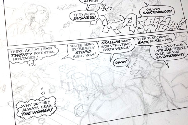
Once you're the letter forms in your own style, the next step is drawing the dialog balloons. There's a variety of approaches: modern to classic, traditional to experimental, domestic to international. The important thing is to get working! Start by reviewing comics you instinctively favor or feel best matches the types of stories you want to tell.
Sound Effects
Apply the same discovery process from word balloons. There's no such thing as getting it right the first time in art school! Some editors don't like sound effects, but they're a visual storytelling element unique to comics. Not using them would be like not using vowels or numbers. Don't let the haters define your voice!
Logos, Titles, Blurbs
The wealth of styles is just as large as any other part of lettering.


